17 Ecommerce UX Best Practices That Increase Sales (2024)

Ecommerce UX should be a balance of focusing on conversion rate optimization and clear, user-friendly design. The two tend to complement each other, with a user-friendly design often increasing the conversion rate by removing friction from the purchasing process.
For most customers, your site is the first thing they see about you, so it needs to be well-designed and easy to use.
1. Sell Benefits, Not Features
Listing features isn’t effective unless you explain what benefits these features will have on your customers’ lives. Instead of simply listing features, explain how these features offer a solution to a common situation or problem on the homepage.
For example, a good skincare product might contain retinol, but the benefit is clearer skin. A supplement might contain protein, but the benefit is faster muscle growth, while a feature of lipstick might be a matte texture, but the benefit is it stays on your lips all day with no need for reapplication.
How to Do It
- Include a benefit for every feature that you list in the product descriptions.
- Use customer stories in blog and video format to show how the products you sell have improved the lives of your customers in real scenarios.
- Establish the problem that your product solves and emphasize these pain points in your copy across all parts of the website.
2. Prominently Display Call to Actions
Each page serves a purpose or directs a site visitor in a certain direction or towards a certain action. One of the most important ecommerce ux principles is to display prominent calls to action, one on each page. This helps with the flow of your marketing funnel and guides customers towards the action you want them to take.
How to Do It
- Try not to make all your calls to action about selling something because this can come across as pushy in the eyes of consumers.
- Make sure all calls to action are clickable and carry out an action such as sending an email or opening a new page.
- Remember to display calls to action across other forms of marketing like email and social media.
3. Make Price Formation Transparent
One of the biggest points of friction for any customer is unexpected costs. If there are price differences between different versions of products, make that clear immediately.
When considering your ux design for ecommerce, make sure the shipping price is prominent at every stage of the user journey. Unexpected costs at the checkout can increase the rate of cart abandonment.
How to Do It
- Have a cart displayed in the corner of the screen at all times with the current price of the products displayed with it.
- Make sure there’s a way for customers to see the price of shipping before they get to the checkout.
- Consider adding a ‘shipping calculator’ feature if shipping is different depending on the product or location.
4. Use a Single Page Checkout
One of the most common reasons for a cart being abandoned is that the checkout process is too long. The faster and shorter the checkout process, the more sales you’ll get and the nicer the ecommerce user experience for your customers.
To keep the checkout short, limit it to only one page long and minimize the number of fields included.
How to Do It
- Only ask for the most crucial information, don’t ask for things like phone number and middle name if you don’t need it.
- Allow users to save details for their next order so they don’t have to type it in manually again.
- Allow for other methods of payment, such as PayPal, so users don’t have to enter their payment details manually.
5. Add Product Reviews
Product reviews act as social proof, which helps convince customers that you’re trustworthy because other customers trust you. Adding social proof in your user journey and marketing materials makes for the best ecommerce experience because it removes doubt from new customers and puts their minds at ease.
Display reviews and testimonials prominently across your site, and include detailed reviews on each ecommerce product page.
How to Do It
- Offer an incentive, such as a discount or free shipping, to encourage customers to leave reviews and increase social proof.
- Sign up for third-party review sites like Google reviews to increase social proof on all channels.
- Respond to any negative feedback with an apology and a description of how you’ll do better in the future to show customers that you value their opinions.
6. Offer High-Quality Large Images
The world is increasingly visual, and users want an accurate idea of how your products will look in their homes. With this in mind, displaying high-quality, large images is crucial. Not only do they look better and are an essential design element, but they also make customers more likely to convert.
Plus, you can reduce return by giving accurate expectations of how the products will look.
How to Do It
- Take 5-12 images of each product, with the product being shown in different use cases.
- Add user-generated content (if it’s good quality) to product posts as a form of social proof and an authentic view of your products.
- Use a professional camera where possible for your product images and videos.
7. Add Product Videos
Uploading a video of the product (depending on the type of product) is a ux best practice because it allows customers to get more understanding of how the product works and therefore to trust the product more.
This increased trust reduces the return rate because customers know exactly what they’re getting. Plus, this product page best practice is more effective than ever with the increase in the popularity of video, as shown by platforms like TikTok.
How to Do It
- Take the product videos with a high-quality camera and pair them with images of equally high quality for the best ecommerce product page design.
- If possible, create the videos with the help of content creators and have them featured in the video – customers are more likely to purchase products with the endorsement of somebody they trust.
- Make sure every product on your online store has its own detailed video (where possible) as part of the product page ui.
8. Offer Detailed Product Information
The more precise and clear data you provide to customers, the more likely you are to provide a great ecommerce experience. By providing a detailed product page, you increase customers’ trust in your product because they have all the data they need to make an informed decision.
How to Do It
- Even if you give a lot of information about a product, avoid a wall of text. Opt for bullet points instead.
- Give every detail possible of your products, including dimensions and materials.
- Make it as easy as possible for customers to get in touch with you with any queries they have about the products.
9. Make Shipping and Return Policy Clear
The easiest way to create a great ecommerce user flow is to remove friction. The removal of friction in the user experience involves keeping customers informed – don’t leave them guessing about product availability, shipping options, and return policies.
Instead, make your shipping and returns policies as clear as possible, by displaying them on product pages as well as on your homepage.
How to Do It
- Display your policies prominently around the site – don’t want until checkout to let a customer know how much shipping will cost.
- Create an easy way for customers to contact you with any queries about shipping and returns.
- Set out detailed Ts & Cs and put them into straightforward language so that they’re not confusing to customers.
10. Ask Minimum Information Needed
The checkout page is one of the pages where ecommerce ux design is the most important. This page can be make or break for your site sales, and if the checkout process is too long, customers will fail to convert.
Only ask the minimum information needed to keep the checkout process as short as possible. Data you’ll need will be email address, shipping address, etc, but you might not need their middle name, for example.
How to Do It
- Do an audit of your current checkout page and automatically remove any fields that aren’t necessary for the sale.
- For ux ecommerce best practice, allow users to save some details so they don’t have to fill them in manually every time.
- If you need something like a phone number as well as an email address for shipping, create an ‘i’ button next to the field and use it to explain why it’s needed.
11. Show a Clear Order Summary
Transparency is a key part of good ecommerce ui design. Show a clear order summary for customers just before they enter the checkout process so they understand exactly what they’re buying. Include all the costs and fees such as shipping, and every product they’ve bought.
That way, customers will feel confident to go forward with the purchase without fear of being caught out by any last-minute additional fees.
How to Do It
- Include other information such as the returns policy for each product in the order summary.
- Make sure the order summary is easily accessible for customers and the fees are communicated from the start, not just at the last stage before checkout.
- Allow customers to access the order summary at any point in the process by clicking on the cart icon in the corner.
12. Offer Check Out as Guests
Many users dread having to create an account to buy a product, and requiring an account can actually increase the cart abandonment rate. To meet the user experience goal of removing as much friction as possible, offer the option for customers to check out as a guest.
It’s still worth offering the option to sign in or register, because this can help you to collect customer data.
How to Do It
- Advertise on another part of your site that you offer the option to check out as a guest. This will remove panic from customers who don’t want to sign up.
- Allow guests to check out with only the minimum information required, nothing unnecessary.
- Make the site so that it remembers the details of customers who have previously signed up, making the login option more pleasant.
13. Offer All Popular Payment Methods
This best ecommerce ux design feature improves both the conversion rate and the user journey around the site. By offering all popular payment methods, you remove friction from the user experience and make it more likely for customers to convert.
Some of the most popular payment methods include PayPal, Apple Pay, and Google Pay. Many of these payment methods are quicker than typing card details in, so they’re great for creating a speedy user experience.
How to Do It
- Advertise the payment methods you offer prominently on your site, so users know before they get to the checkout.
- If possible, get the official badges of these payment methods and add them to your website.
- Research competitor sites and large companies to see which payment methods they use, then add them to your site.
14. Display an Order Confirmation
The best ux for ecommerce is transparent with the customer about what they’re buying from start to finish. One of the most useful features you can add is an order confirmation, so customers know exactly what they’ve bought.
You should display a prominent order summary while customers shop, then a prominent order confirmation once they’ve checked out to confirm all the products purchased.
How to Do It
- Pair the order confirmation page with an order confirmation email for maximum transparency.
- Include useful information such as the expected delivery date and shipping address on the order confirmation.
- If the user has logged in, create a space where they can check previous orders and see a list of order confirmations.
15. Make Contacting You Easy
The easier it is to contact you, the more your customers will trust you. This is also a good ux design principle because it removes friction. If a customer has a query about a product and there’s an easy way to contact you for more information, they won’t go to a competitor site as a result of long wait times.
Contact methods to consider include chatbots, live chat, contact forms, a phone number, and email.
How to Do It
- If you have the budget for it, consider hiring a remote team from places around the world to cover different time zones.
- Create automated responses for commonly asked questions so you don’t waste too much time manually responding, but customers get a fast answer.
- Make yourself contactable on as many channels as possible, including social media.
16. Offer a Site-Wide Search
One way to promise a good ecommerce search experience is to allow customers to search your entire site. Often, people know exactly what type of product they’re looking for, and they don’t want to have to search through all the products and sizes manually.
Invest time and money in a properly working search with autocomplete. Site-wide search removes friction and saves customers time.
How to Do It
- Add in a handy filter feature so customers can filter colors, sizes, etc, to find what they want.
- Make sure your products have easily recognizable names and descriptions so users can find them easily in the search.
- Make the search bar prominent on your site for ease of customer access.
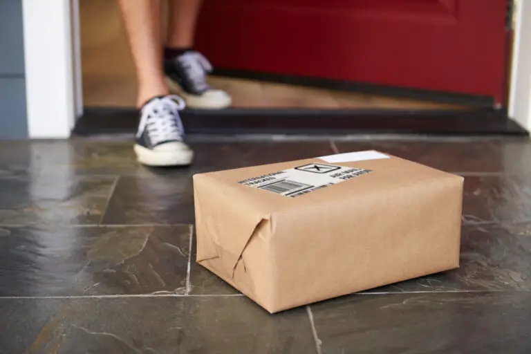
17. Send Order Updates via Email
Keeping customers in the loop is a must have for any user flow. The more informed customers are, the more realistic their expectations will be, especially if you give them an honest overview of things like shipping times.
You can also use this channel to ask for reviews and feedback, especially about the product they’ve ordered. You can also invite customers to try other, similar products.
How to Do It
- Make sure you include in the email a way for customers to contact you if they have any queries.
- Include as much information as necessary without bombarding the customer. Stick to bullet points, not blocks of text.
- Give clear expectations about shipping times, but don’t overpromise. It’s better to underpromise and overdeliver.